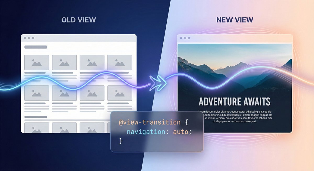
Smooth Animations with CSS @view-transition

As a web developer, I'm always looking for new ways to make my websites smoother and more engaging. Recently, I stumbled across something pretty exciting—CSS's new @view-transition API. If you're like me and are always keen to explore new ways to add polish to your projects, you're going to love this.
What Exactly Is @view-transition?
The @view-transition API allows us to easily create animated transitions between different DOM states or pages without relying heavily on JavaScript libraries or complicated CSS animations. Essentially, it provides a smoother, more visually appealing user experience when navigating your site.
Why I'm Excited About It
Before discovering this, creating smooth animations between pages often required quite a bit of extra JavaScript or animation libraries like GSAP or Framer Motion. While these tools are powerful, they can sometimes add complexity and overhead. The beauty of @view-transition is that it simplifies this entire process.
How to Use It: My First Attempt
Here's a simple example of how you might use it:
@view-transition {
  navigation: auto;
}

::view-transition-old(root),
::view-transition-new(root) {
  animation-duration: 0.3s;
}
This snippet enables smooth transitions on navigation. What's particularly nice is that browsers handle a lot of heavy lifting behind the scenes, making these animations performant and easy to implement.
Transitioning Specific Elements Using view-transition-name
You can also directly control transitions between specific elements by using the view-transition-name property on HTML elements. Here's a clear example:
HTML:
<div class="box" style="view-transition-name: box-transition;"></div>CSS:
::view-transition-old(box-transition),
::view-transition-new(box-transition) {
  animation: fadeScale 0.5s ease-in-out;
}

@keyframes fadeScale {
  from { opacity: 0; transform: scale(0.8); }
  to { opacity: 1; transform: scale(1); }
}
In this example, the browser smoothly animates between states of an element tagged with view-transition-name. It's particularly useful for emphasizing UI changes clearly and fluidly.
Things I Learned Along the Way
It's Progressive: Not all browsers support
@view-transitionyet. Make sure you provide fallback animations or behaviors.Minimal Setup: Setting up is refreshingly straightforward compared to traditional animation methods.
Highly Customizable: You can target specific elements, transition durations, easing functions, and more.
Challenges to Keep in Mind
As it's a relatively new feature, there are some browser compatibility issues to be aware of. Always check browser support and plan accordingly.
Final Thoughts
I'm just scratching the surface with CSS @view-transition, but the potential here feels huge. If you're looking to upgrade your site's navigation or interactive elements with minimal hassle, definitely give this a shot.
Happy coding!